DEMO OF REDESIGNED UI
ABOUT THE PROJECT
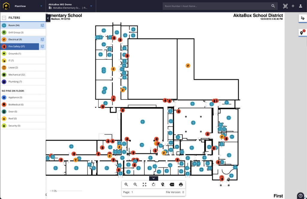
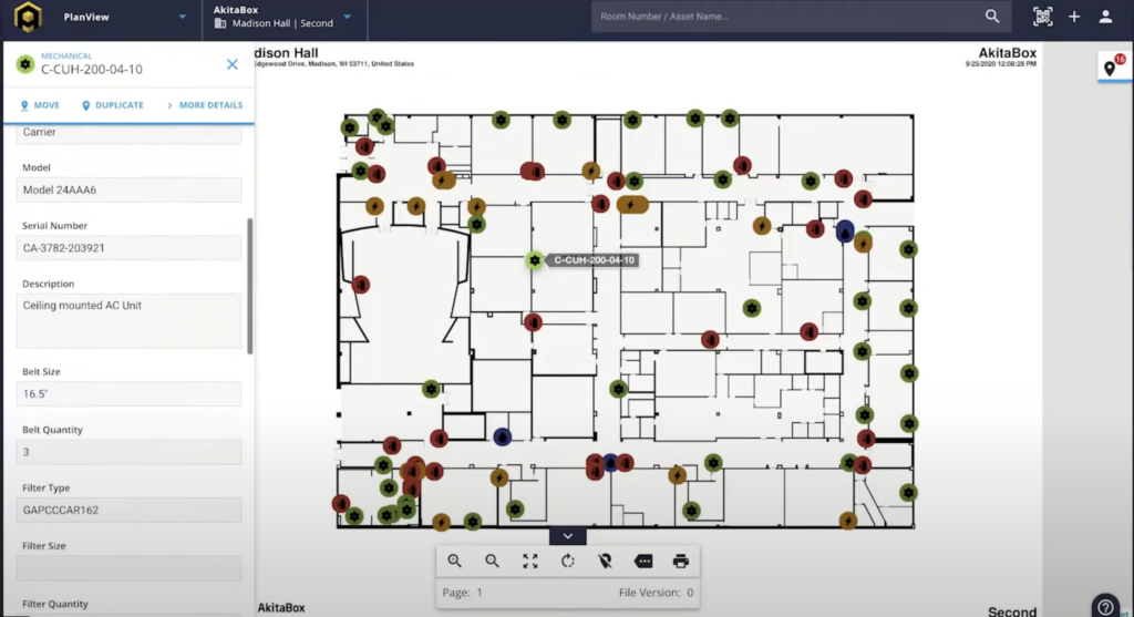
AkitaBox is a software company that helps companies manage their facility assets and maintenance schedules. I redesigned this UI to more efficiently show desired building assets for facility maintenance staff. Workers need to be able to see details and locations of assets in their building to be able to quickly respond to work orders and requests. Currently we have thousands of customers using this product to help manage their building.
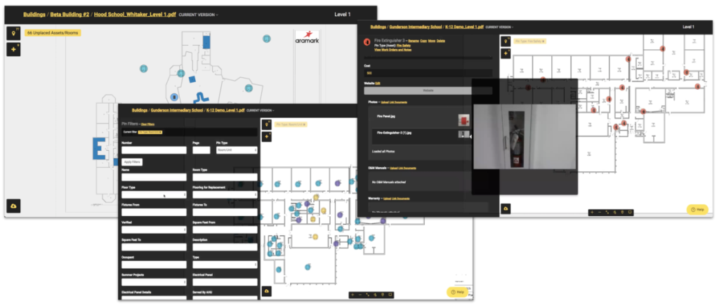
This was one of the first projects I worked on at AkitaBox. The main issue was it did not match the design style of the rest of the software. Shown below was the original design I had to work from, in addition to the redesign I was able to design an asset filter which proved to be a bit challenging to design since it needed to have filters within filters but not overwhelm the UI. I ran a user testing group on the redesign and new filter options which helped fine tune the designs and interactions before building and launching the new PlanView.


